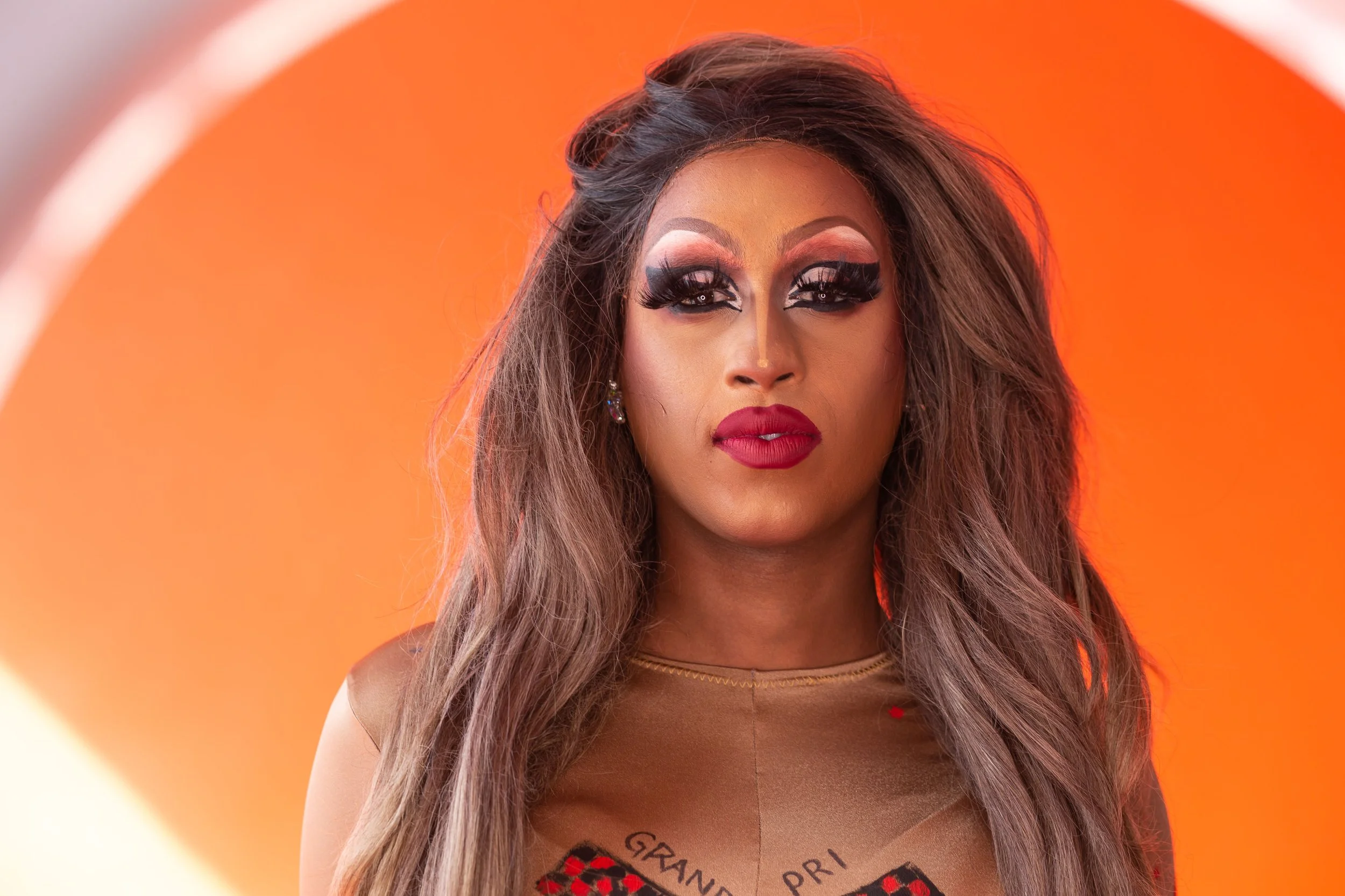
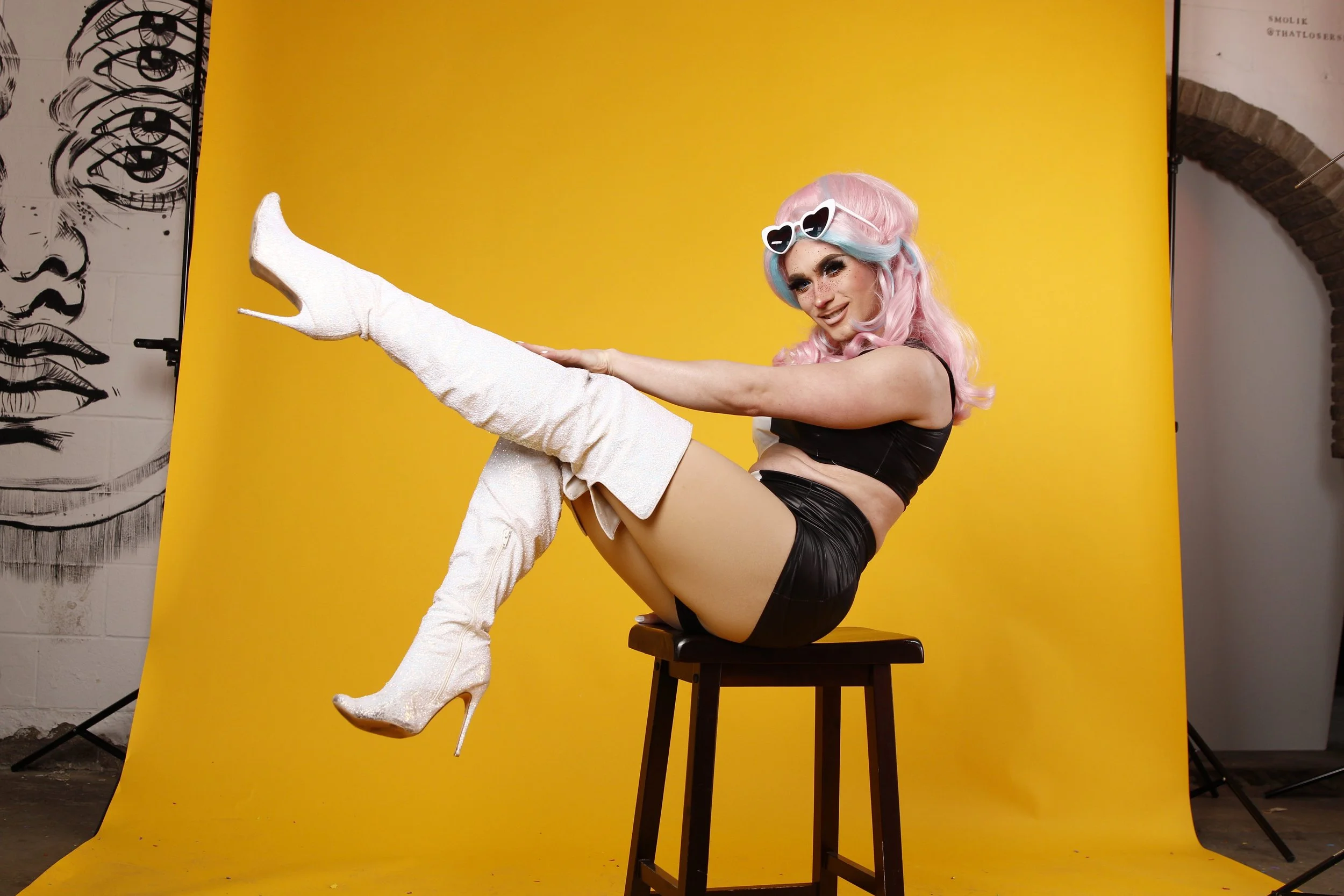
2019 Toronto Pride Festival
Design has the power to bring people together.
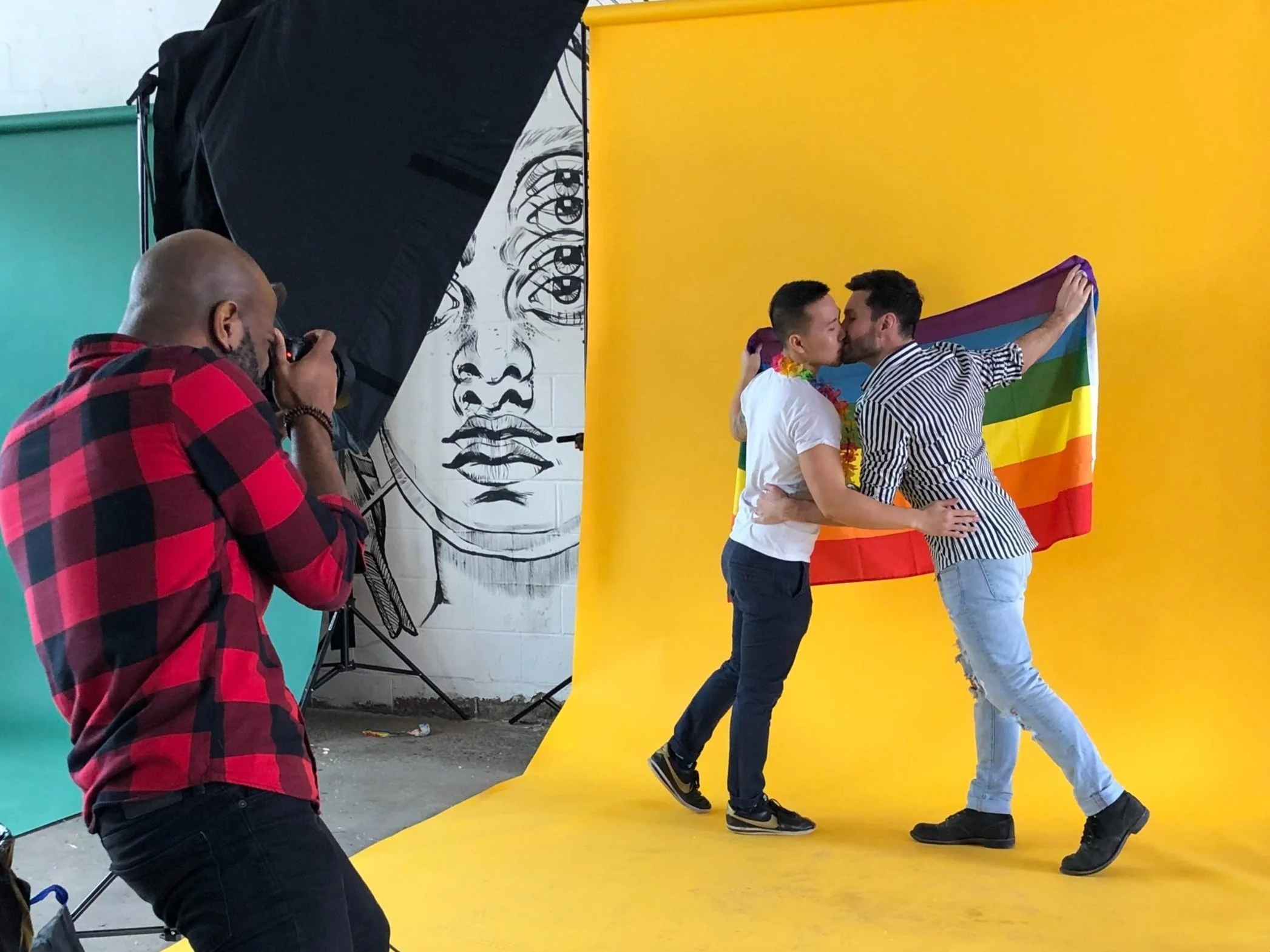
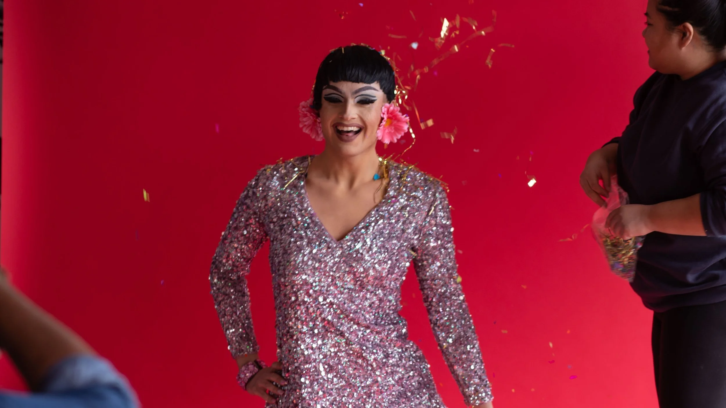
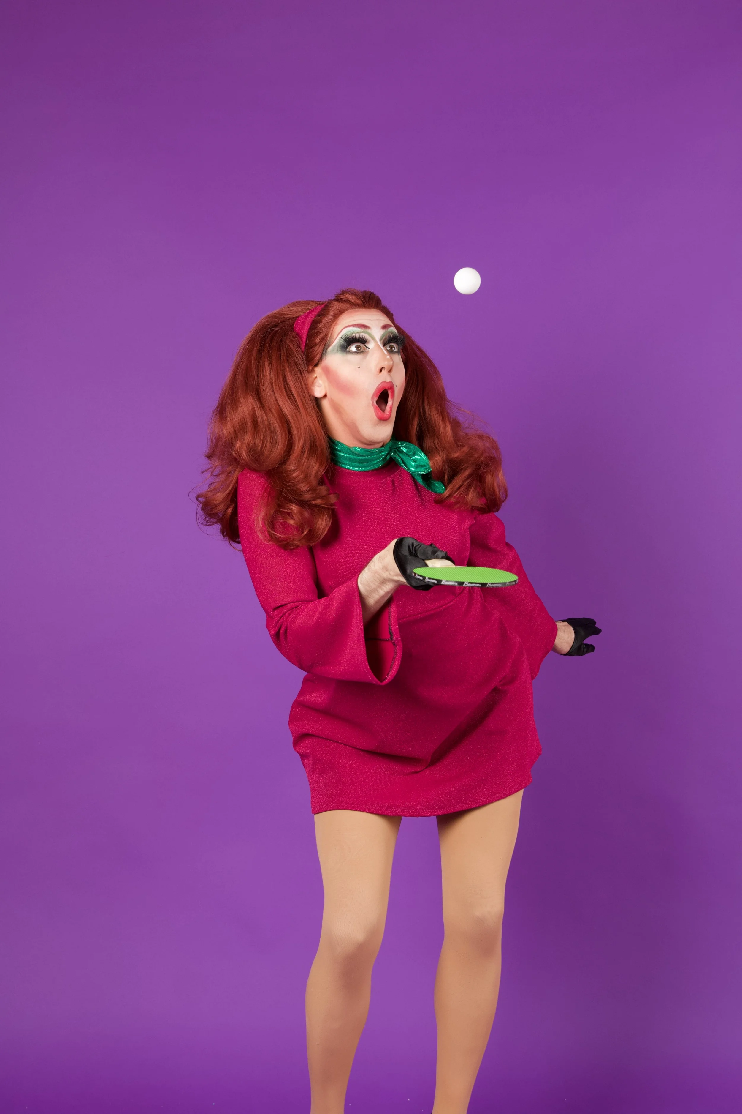
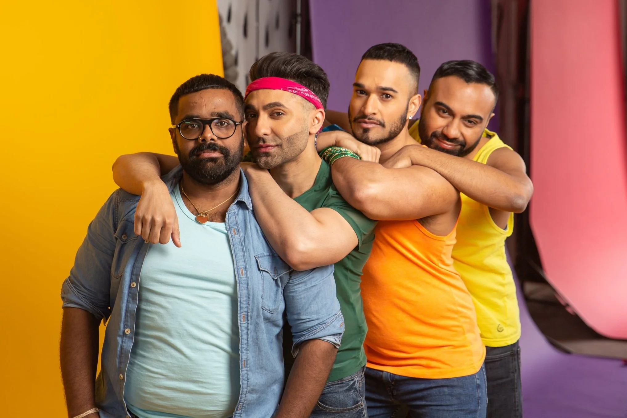
For Pride Toronto 2019, our goal was to create a visual identity that celebrated individuality while reinforcing a shared sense of community, belonging, and pride.
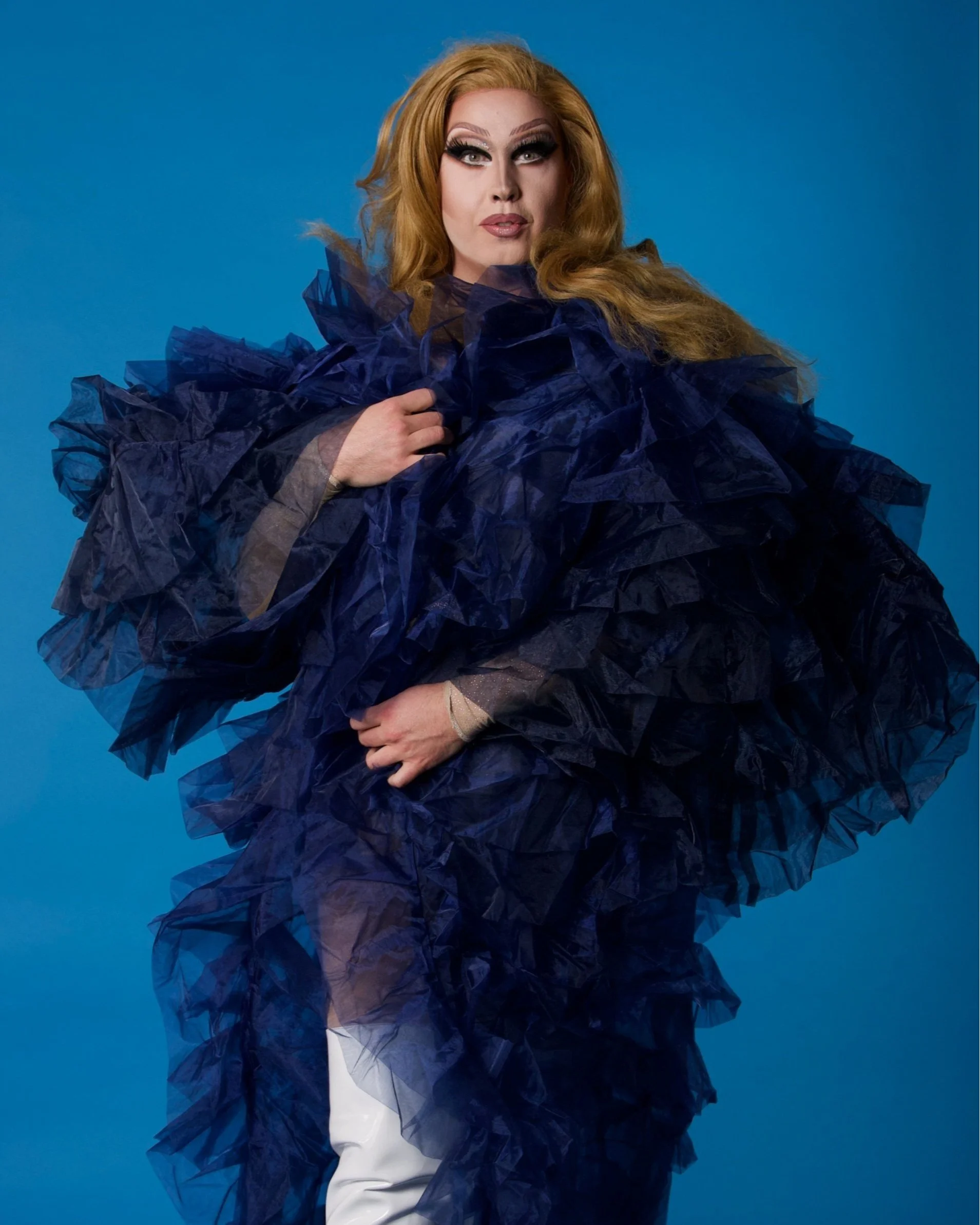
Working as part of a small creative team, I collaborated closely with Pride Toronto to develop campaign assets across print, digital, environmental graphics, merchandise, and promotional materials for one of the organization's most significant festivals to date.
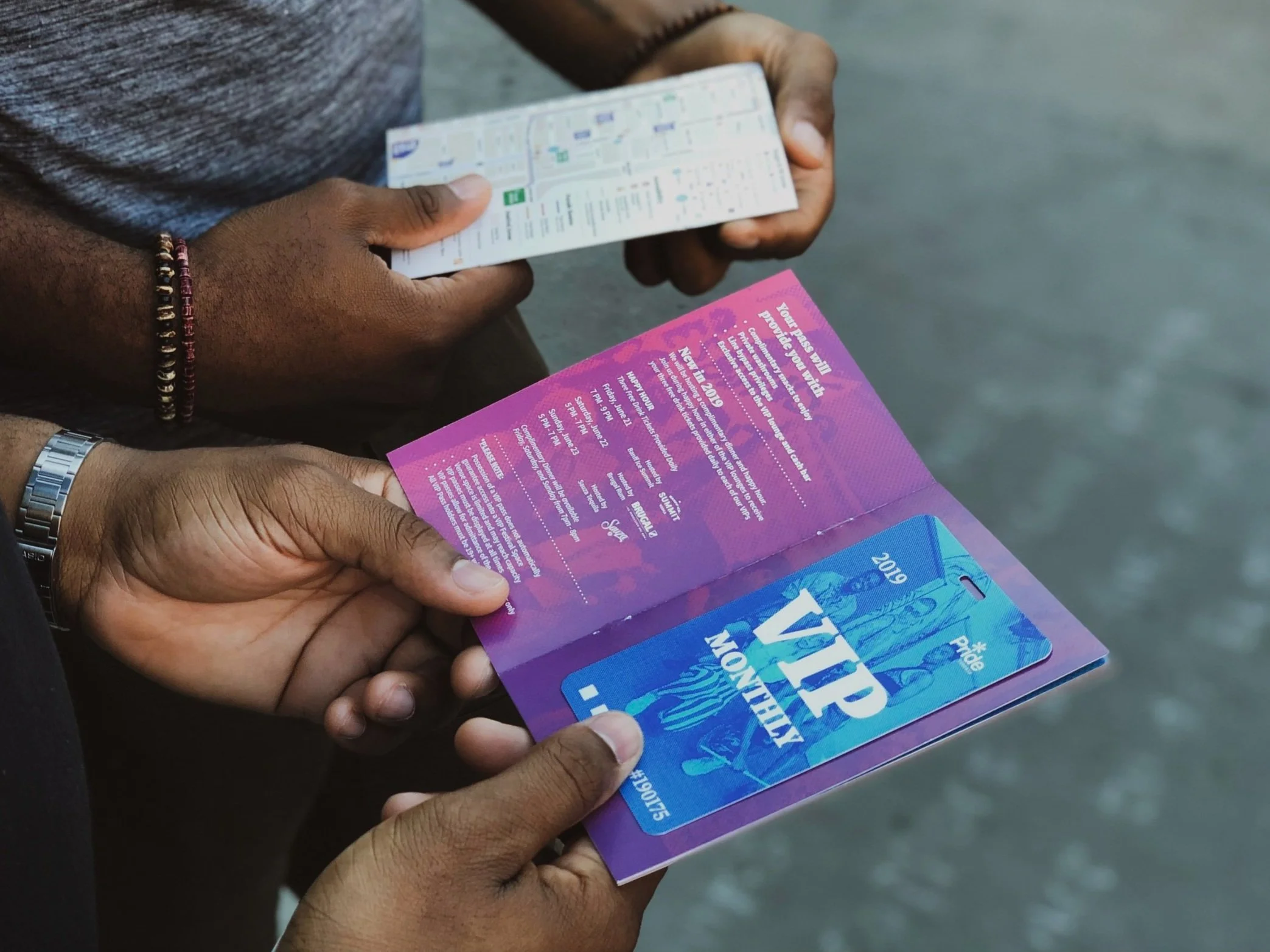
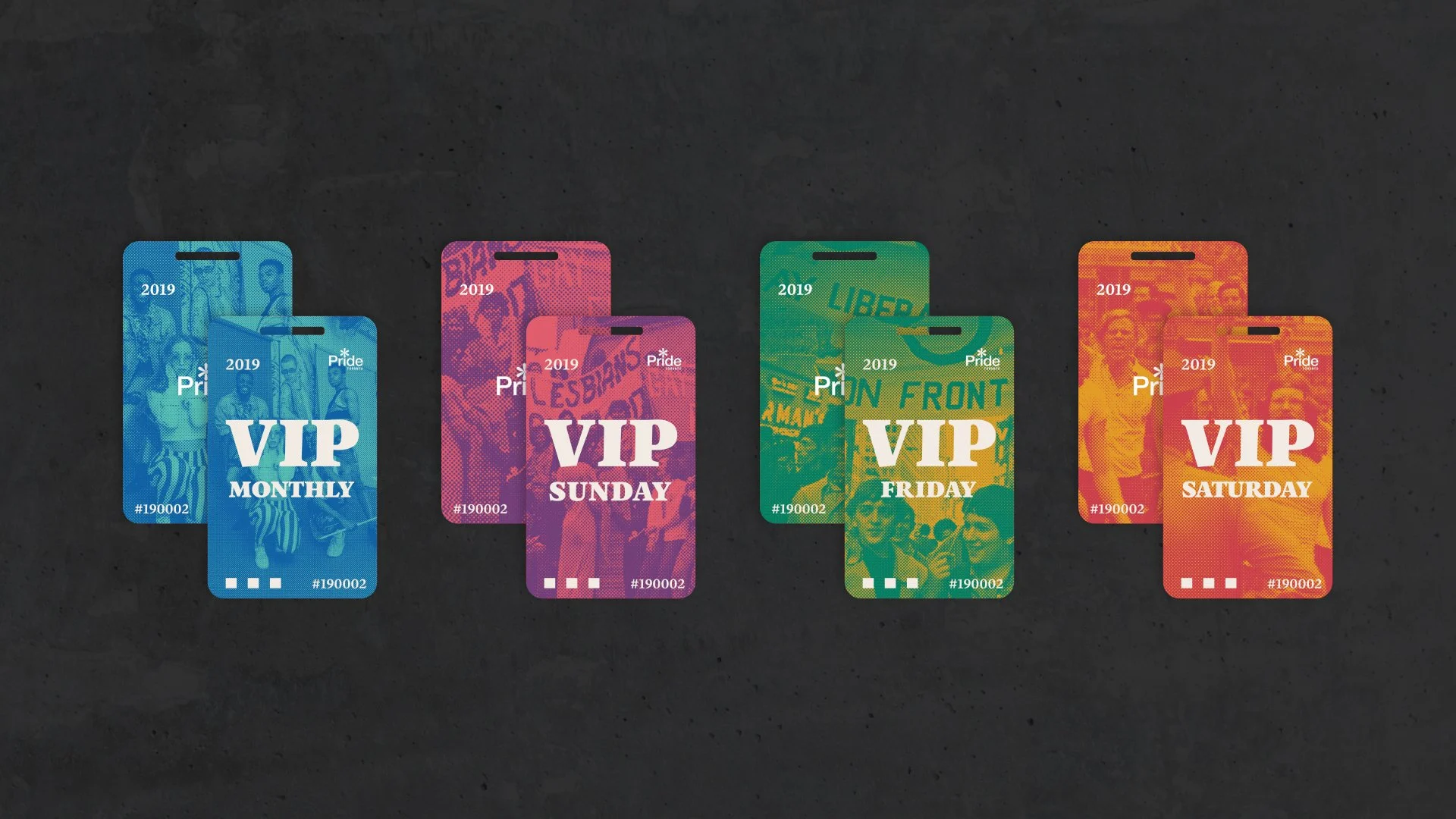
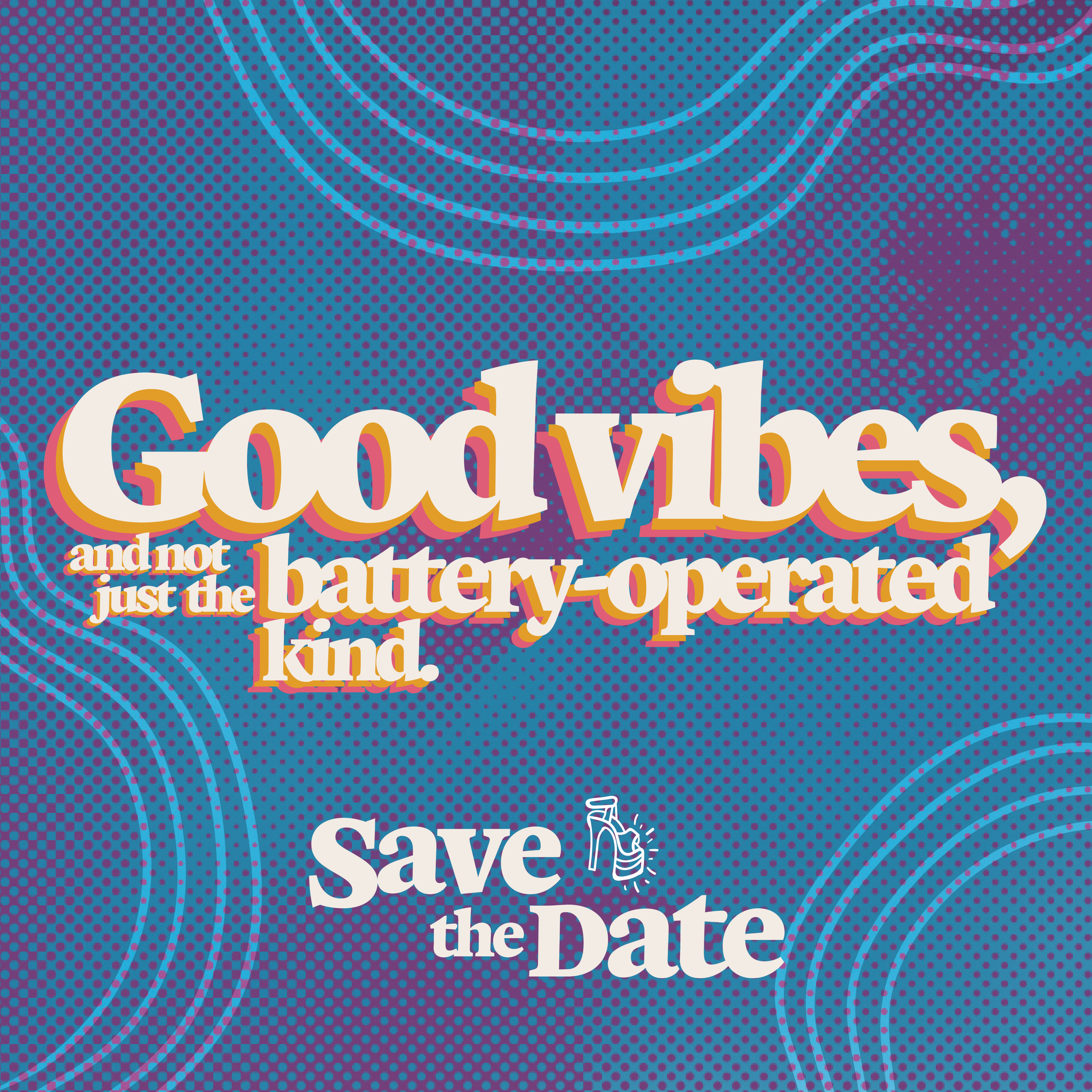
Project detailsThe 2019 festival marked the 50th anniversary of the Stonewall Riots, a pivotal moment in LGBTQ+ history. To honour this milestone, we reimagined Pride Toronto's brand through a nostalgic 1970s lens, combining a softened rainbow palette, ben-day dot textures, playful illustrations, and bold slab-serif typography. The resulting identity celebrated the movement's roots while creating a welcoming and inclusive visual language that connected generations of the community.
The campaign reached an audience of more than 1.7 million attendees throughout Pride Month, helping support one of the largest Pride celebrations in the world.
ROLE: Graphic Designer
TIMELINE: 8 months
YEAR COMPLETED: 2019
COLLABORATORS
Erika Tran, Creative Director
Elize Stolk, Graphic Designer
Marco Fuentes, Motion Designer
Andrew Williamson, Photographer
Dwayne Gomez, Photographer
Impact statsAudience reached: 1.7M+ attendees
Event footprint: city-wide, month-long festival
Tourism draw: 1.1M visitors influenced to travel
International audience: 5% international attendance
Regional audience: 30% from outside the GTA
Economic significance: $374M GDP contribution
Partnering closely with Creative Director Erika Tran,
I helped shape and execute the creative direction for Pride Toronto's 2019 festival campaign.
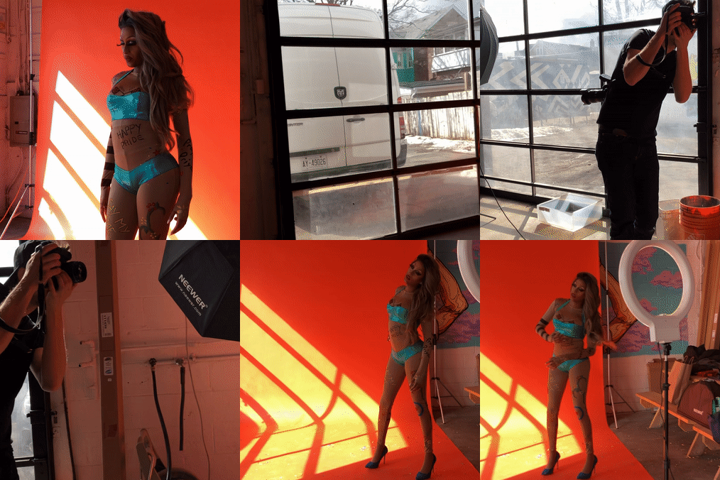
I played a key role in developing the visual language of the identity, focusing on image treatment, texture systems, and production-ready design assets. Drawing inspiration from vintage print ephemera and 1970s editorial design, I created photo treatments incorporating aged film textures, ben-day dots, and retro graphic elements that became recurring motifs throughout the campaign.
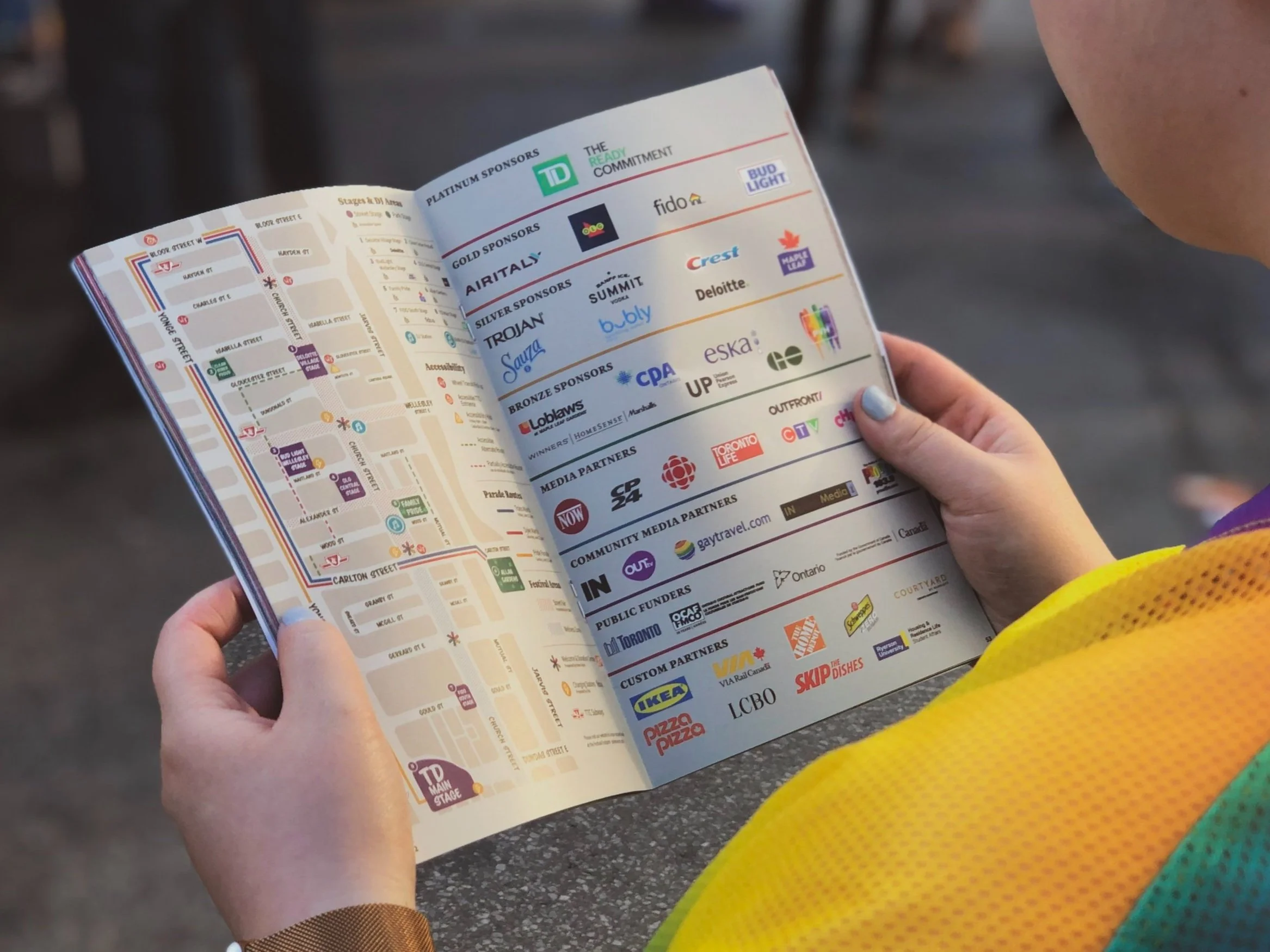
My responsibilities included the design of the official festival map, enamel pin collection, festival credentials, VIP package materials, posters, social content, and advertising assets. By applying the visual system across a broad range of touch points, I helped create a cohesive festival experience that connected audiences across both physical and digital spaces.